Using colors is about balancing hue, tint, tone, shade, and temperature. If you are a designer, you should know color theory better than anyone. In this article, we will introduce you to color theory very quickly and simply.
Hue
Refers to the dominant Color Family of the specific color we’re looking at. White, black, and gray
are never referred to as a Hue.
Tint
Hue or a mixture of pure colors with only White added (or moving closer to white)

Tint lightens the color but never makes it brighter.
Tone
Hue or a mixture of pure colors with only Gray added (or moving closer to gray)

Tone colors are more pleasing to the eye.
Shade
Hue or a mixture of pure colors with only black added (or moving closer to black)

A Shade darkens the color but the hue remains the same.
Temperature
Our perception of color as being either warm or cool.

Warm colors are also referred to as Active Colors and they are created by adding yellow or red to the colors.
Cool colors are created by adding blue and green to the original color and they represent winter, freshness, and calm. They remind us of ice, water, and the sky.
Color Models
CMYK: Cyan, Magenta, Yellow, Black
Uses what is called subtractive mixing of lights to derive different colors.
RGB: Red, Blue, Green
Uses what is called additive mixing of light to derive different colors.
HSB (V): Hue, Saturation, and Brightness (Sometimes modeled as Value or Lightness)
Use a mix of these attributes to derive different colors.
1. CMYK
CMYK is called subtractive because it refers to light and the page.
- Used for pages and with printers.
- When these 4 colors are mixed together the overlap results in black.
- Subtractive=Because you are removing the white that’s there.
2. RGB
RGB is called additive mixing of light where the overlap is white.
- Used for digital screen design.
- Like 3 bright red, green, and blue lights projecting at you.
- Turn them all at full brightness and you get pure white light.
- Turn them all off and you would see blackness
3. HSB
Hue, Saturation, and Brightness change the purity and density of the color as well as how much light is projected through the colors.
- How people actually see colors and how our brains work.
- Used by UI and Visual Screen Designers.
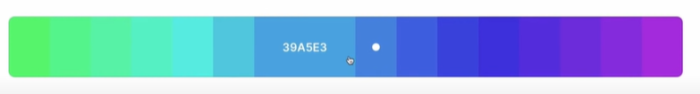
- Hue – a radial 360 scale of all colors.
- Saturation – How dull or rich the color is.
- Brightness – Whether the color is closer to white or closer to black on the scale.
Because we are going to use the HSB method to design UI we have to change the model from RGB to this
Warm vs Cool colors
Warm colors are referred to as Active Colors because they draw more attention.
Cool colors tend to be Passive Colors.
Depending on the color scheme soft warm colors can be Passive Colors and Vivid colors can roll Active colors.
Color Categories and Families
The trick to getting really great-looking color pallets is to stick with one category or pair one category with neutrals. The best part is you only need to find 1 color to make it all match!
6 colors categories:
- Jewel Tones
- Pastel Tones
- Earth Tones
- Neutral Tones
- Fluorescent Tones
- Shades
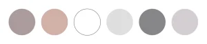
1. Jewel Tones
This category is richly saturated hues and named after Gems like Sapphire blue, Ruby red, Amethyst purple, Citrine yellow and Emerald Green.
These colors are regal and deep and impart a sense of luxury.
Saturation and Brightness Range:
S: 73-83
B: 56-76

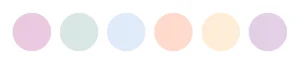
2. Pastel Tones
This belongs to the pale family of colors. Pink, Mauve, and baby blue are commonly used pastel pallets as well as mint, peach and periwinkle, and lavender.
The colors of this family are usually described as soothing. We create these colors by reducing the saturation and adjusting the tint or dragging our color pickers into the white area.
The ideal saturation and brightness range for pastel Tones:
S: 14-21
B: 89-96
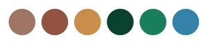
3. Earth Tones
These are colors commonly found in nature and many rath tones originate from clay pigments like Umber, Ochre, and sienna they can be created by combining a pure hue with white, black or gray.
They are considered in the more broad sense, neutral colors. They are influenced by the tones of trees, forests, seas, and sky and are muted to flat emulate natural colors.
We create earth tones by increasing saturation and adjusting the tone or dragging our color pickers into gray.
The saturation and brightness range is
S: 36-41
B: 36-77
4. Neutral Tones
Pure neutral tones include black, white, beige, and all grays. While near neutral tones include browns, tans, and darker colors. These are created by desaturating our colors and they pair well with any of the other categories to create balance. Saturation and brightness range is
S: 1-10
B: 99-70
5. Fluorescent Tones
These colors are sometimes called Neon Tones. Fluorescent is a result of photoluminescence, phosphorescent color emits light when excited by visible or ultraviolet light.
In the physical world, this is created by neon tubing in which light is projected through ultraviolet reactant paint colors. But in the digital world, we can get a similar effect by applying very bright and highly saturated colors to our designs. We create these by increasing the brightness and the tone. Saturation and Brightness settings:
S: 100-63
B: 100-82

6. Shades
The two main shades are black and white which are not normally considered colors but rather the absence of light or dark or the addition of pure shade or pure tint. Other shades include all varying degrees of gray.
The Ideal saturation and brightness range for this group:
S: 0-0
B: 0-100

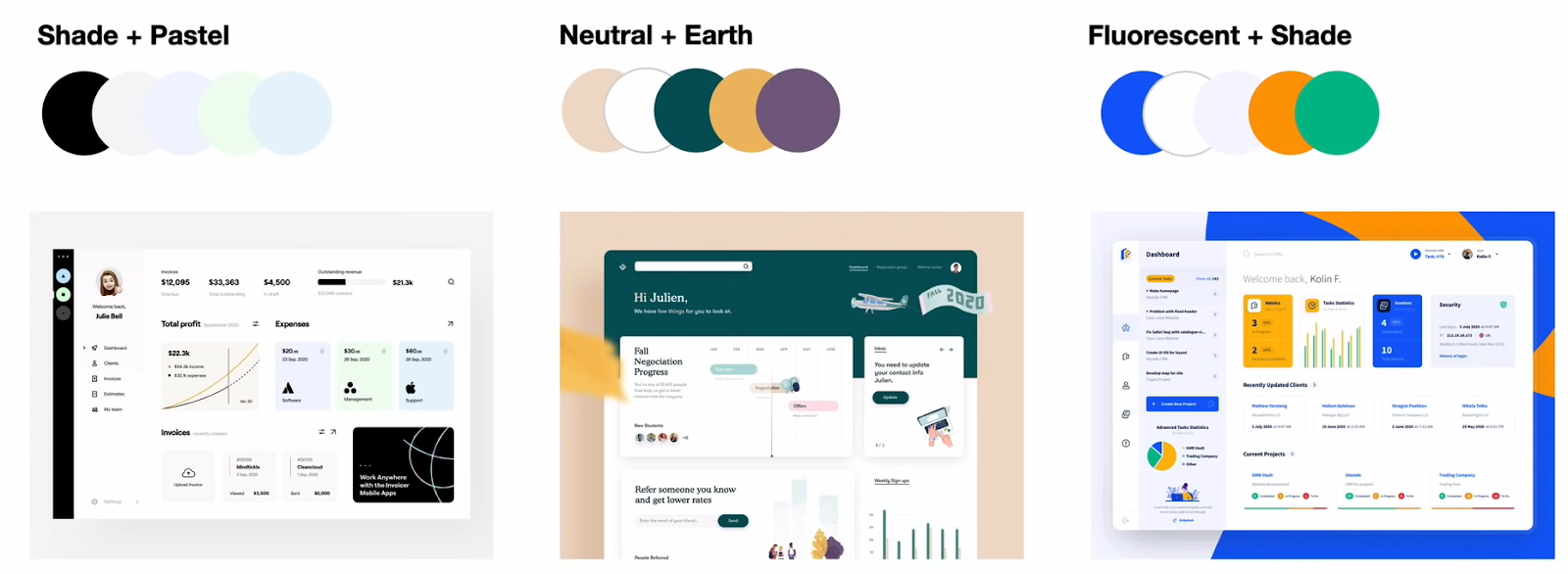
Combining Color Categories
We can always combine these categories such as Pastel+Earth or Jewel+Pastel.
The best user interface designs use a combination of the main color categories along with neutrals and shades
Shade+Pastel are commonly used. Neutral+Earth are seen a lot and fluorescents and shades whether on dark design or light design are very popular
Suggested Article: